Overview
A simple, intuitive, interactive model for visualising how well we are staying inside the doughnut.
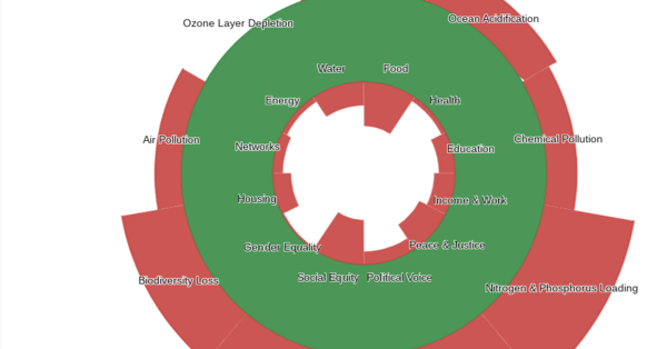
At this link, you will find an example of a doughnut, where you can directly directly adjust the values of the inner and outer circles including:
- food
- health
- education
- income and work
- peace and justice
- political voice
- social equity
- gender equality
- housing
- networks
- energy
- water
On the inner circle and
- climate change
- ocean acidification
- chemical pollution
- nitrogen and phosphorus loading
- freshwater withdrawals
- land conservation
- biodiversity loss
- air pollution
- ozone layer depletion
On the outer circle.
At the top of the interactive, there is a slider which allows the user to compare their custom doughnut to the 10 biggest economies. Data for these countries was based on OECD findings which were adjusted according to this document. Note that most of these scores are comparison based such that the best country will always get a 0 and the worst will always get a 10 though some lend themselves to objective measurement such as biodiversity loss which is measured by what percentage of mammal, bird and plant species are endangered. I'm working my way through
I'd love to hear any feedback you have for things I can improve on in this model, leave a comment down bellow or contact me directly at grant.r.official@gmail.com
I'm particularly interested in any quantitative relations you can find between say, education and income because I know that all these factors are linked and a major advantage of using a calculator for this model could be the ability to accurately display the effects of a change in any of these slices.
Update V 1.1.1
- Easier to adjust sliders
- Country presets (incomplete)


Jaqueline Vasconcellos
Paris
Business regenerative design, connect and learn with other people about regenerative design.